
Mobile-First Surveys: Designing Research for a Thumb-Scrolling World

The survey respondent of 2026 is not sitting at a desktop with a coffee and twenty spare minutes. They are standing in a checkout line, riding a train, or half-watching television with a phone in one hand. Mobile devices now carry the overwhelming majority of the world's connectivity, and that shift has quietly rewritten the rules of questionnaire design. Surveys built for a mouse-and-keyboard era dense grids, long scales, multi-page routing do not survive contact with a six-inch screen and a thumb. Designing for that reality is no longer a niche specialization; it is the baseline competency for any research function that wants usable data.
The Scale of the Shift: Why Mobile Is No Longer Optional
The infrastructure numbers explain why mobile-first design has become mandatory rather than optional. According to the International Telecommunication Union's Facts and Figures 2025 report, mobile broadband now accounts for 89% of all mobile subscriptions worldwide, up from under half in 2015 — a near-doubling in a decade that reflects the near-total displacement of voice-only connections by data-capable smartphones. Separately, reporting from TechCrunch on Sensor Tower's State of Mobile 2026 findings shows that global consumers spent approximately $85 billion on mobile apps in 2025, a 21% year-over-year increase, while total app session volume worldwide topped one trillion for the first time. Every one of those trillion sessions is a moment when a respondent could plausibly be reached — and every one of those sessions is also a moment when a poorly formatted survey will be abandoned within seconds.
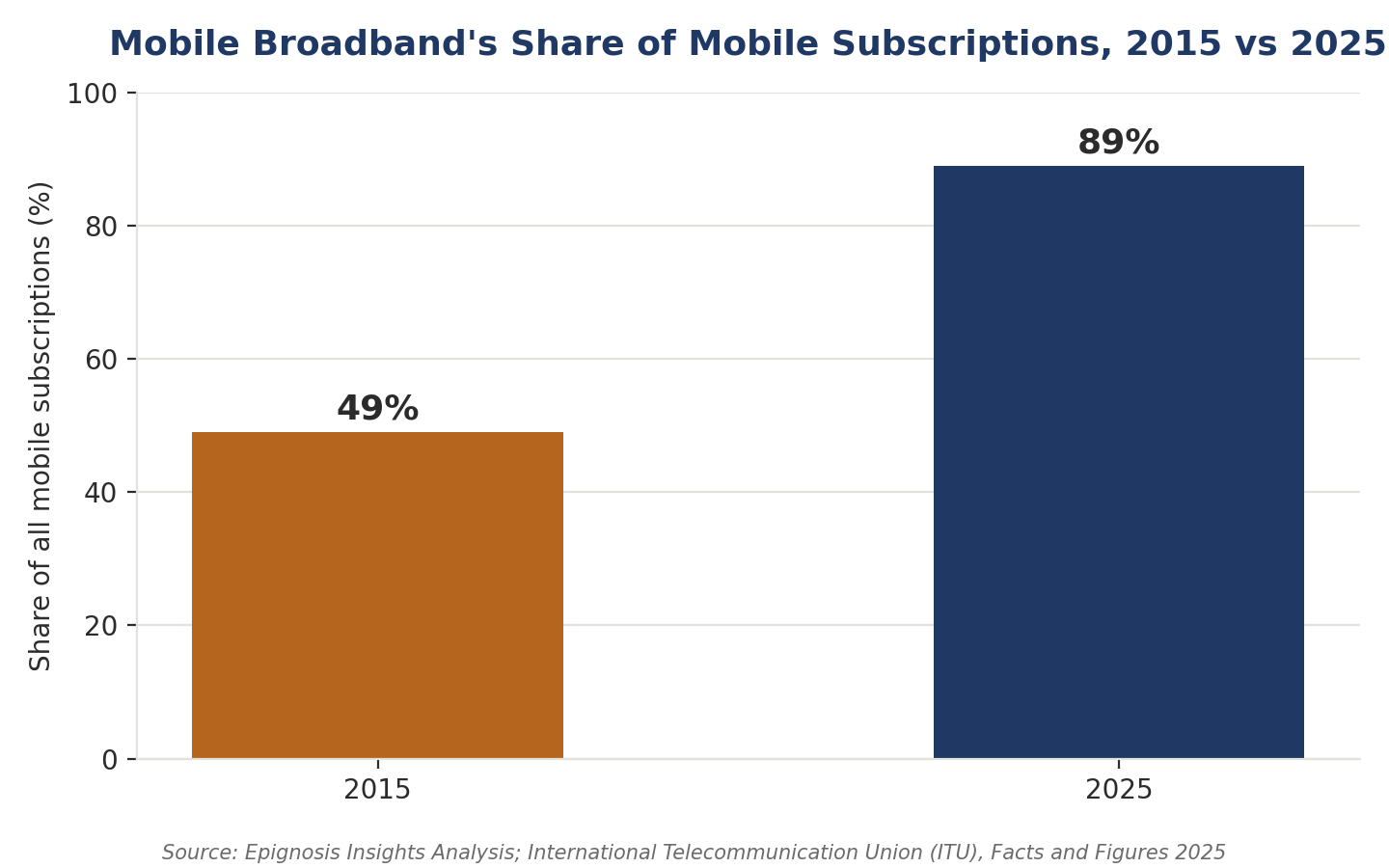
Figure 1: Mobile broadband's share of global mobile subscriptions nearly doubled between 2015 and 2025.
What 'Mobile-First' Actually Means for Questionnaire Design
Mobile-first is frequently used as a synonym for 'responsive layout,' but the ESOMAR/GRBN Guideline on Mobile Research frames it more precisely: researchers must account for smaller screens, potential data costs to the respondent, and the situational context in which a mobile response is likely to be given often while distracted, in transit, or in a public space. That guidance translates into concrete design constraints. Matrix and grid questions, which compress a dozen rating scales into rows and columns on a desktop screen, become nearly unusable when forced onto a mobile viewport; they either shrink below a legible font size or require horizontal scrolling that respondents rarely tolerate. Long, unbroken scales suffer the same fate. The practical fix is to decompose grids into single-item screens, favor five-point over eleven-point scales, and default to vertically stacked answer options with generously sized tap targets.
The Data Behind the Design Choices
The scale of mobile-collected feedback is no longer a theoretical argument it shows up in the disclosures of the platforms that run this infrastructure. Qualtrics International's Form 10-K filing with the U.S. Securities and Exchange Commission states that its Experience Management platform has collected more than 10 billion Experience iDs over its lifetime, which the company describes as the largest human sentiment database in the world — a dataset built overwhelmingly on mobile-originated responses. Consulting-side research reinforces the same pattern from the demand side:
Deloitte's most recent Digital Consumer Trends fieldwork, conducted with a nationally weighted sample of connected consumers, puts smartphone penetration at 95%, ahead of laptops and every other connected device category it tracks. Put together, these figures describe a closed loop: near-universal smartphone ownership feeds near-universal mobile response, and platforms are scaling their data infrastructure accordingly.
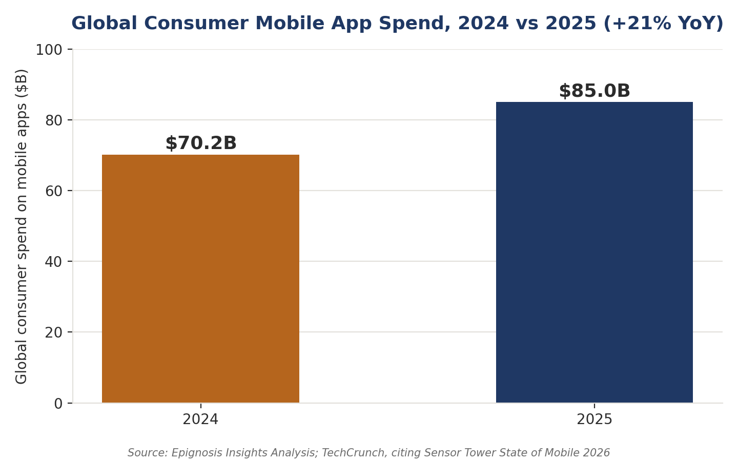
Figure 2: Global consumer spend on mobile apps grew 21% year-over-year to reach an estimated $85 billion in 2025.
Practical Principles for Thumb-Scrolling Research
Translating the statistics into a working questionnaire comes down to a short list of disciplined choices:
- Cap survey length at five to seven minutes; every additional minute compounds mobile drop-off risk.
- Replace grid and matrix questions with single-item screens and progressive disclosure.
- Use large, thumb-friendly tap targets and avoid free-text entry wherever a structured alternative exists.
- Show a visible progress indicator so respondents can gauge remaining effort before abandoning mid-flow.
- Design and test on an actual small screen first, then adapt upward to tablet and desktop — not the reverse.
What This Means for Research Programs Going Forward
For research teams, the implication is structural rather than cosmetic. Questionnaire design, sampling strategy, and incentive structures all need to be built around the assumption that most respondents will complete a survey in a fragmented, distracted, mobile moment — not a dedicated desktop session. At Epignosis Insights, this shift informs how we script, pilot, and field every quantitative instrument: mobile rendering is tested before any other device, question sets are modularized for single-screen delivery, and length is treated as a design constraint from the first draft rather than a problem to solve after fielding begins. As mobile broadband approaches saturation and platforms report session volumes in the trillions, the research organizations that treat mobile-first design as core methodology — not an afterthought — will be the ones capturing data that actually reflects how people live.