
The Anatomy of a Market Research Report Nobody Reads

Most market research reports are read exactly once: by the analyst who wrote them, during final proofing. Everyone else skims the executive summary, screenshots one chart for a slide deck, and lets the remaining forty pages sit in a shared drive until the next budget cycle. This isn't a content problem. It's an architecture problem. Companies keep commissioning research at record volumes, yet the insight rarely survives the trip from report to decision. The rest of this piece breaks down where that report goes wrong, what the data says about the gap, and how a different structure closes it.
The Data Graveyard Problem
The scale of the disconnect is larger than most research teams admit internally. Only 15% of executives consistently fold customer input into their decisions, even though the same organizations keep funding studies meant to inform exactly those decisions, according to McKinsey & Company. Deloitte's long-running Insight-Driven Organization research tells a similar story from a different angle: fewer than four in ten companies, roughly 37%, place themselves in the top tiers of data-driven decision maturity, and only a tenth of those reach the highest category. The output exists. The habit of using it does not.
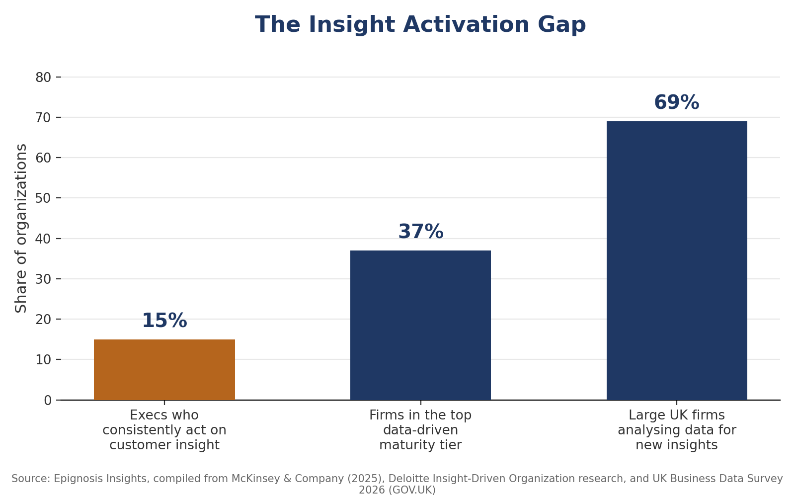
Figure 1: The gap between investing in insight and acting on it, compiled by Epignosis Insights.
Anatomy of the Report Nobody Reads
Pull apart a typical report that lands unread, and the same three structural flaws show up almost every time.
The Wall of Text
Findings are presented in the order they were fielded, not the order a reader needs them. Methodology sits on page two, ahead of anything a business leader can act on, so the person deciding budget allocation has to hunt for the one paragraph that matters to them.
The Buried Insight
Charts describe what happened without stating what it means. A slide showing category share sliding two points is data. A slide showing that same data next to the pricing decision it should trigger is an insight. Most decks stop at the former.
The Missing “So What”
Recommendations, when they appear at all, are generic enough to apply to any client in the sector. A reader who can't tell what to do differently on Monday morning has no reason to open the document again on Tuesday.
Why the Gap Keeps Widening
None of this is happening because organizations are ignoring data infrastructure. The opposite is true, which is what makes the gap so costly. The global insights industry grew from roughly $130 billion in 2023 to $153 billion in 2025, according to ESOMAR's Global Market Research report, as spending on research, software, and reporting all expanded together.
NielsenIQ's 2025 annual report points to the same pattern at the supplier level, describing a business that now measures consumer behaviour across more than 90 countries and roughly $7.4 trillion in tracked consumer spend. Government data confirms the appetite is genuine rather than just supplier-side marketing: the UK's 2026 Business Data Survey found 86% of businesses now handle digitised data, and 69% of large firms actively analyse that data to generate new insights. Yet a Marketing Dive and Social Media Today survey of marketing and social teams found that a third of respondents, 33%, said their organization missed or reacted too late to a cultural shift specifically because consumer insight didn't reach the right desk in time. Investment is climbing. Activation is not keeping pace.
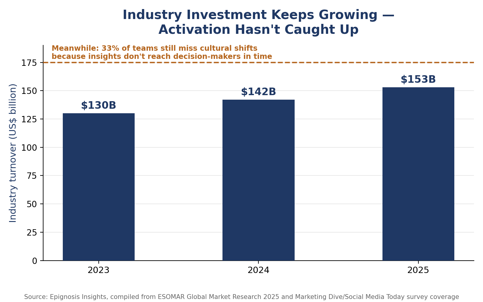
Figure 2: Industry turnover growth against a persistent activation shortfall, compiled by Epignosis Insights.
The Fix: Rebuilding for Activation, Not Archive
Closing the gap is less about better analysis and more about redesigning the artifact itself around how people actually consume information under time pressure.
Lead With the Decision, Not the Data
Open with the one decision the report should influence, stated in a single sentence, before a single chart appears. Methodology and full data tables move to an appendix, not the front matter.
One Page Before Fifty
Every long-form deliverable should ship with a standalone one-page brief: the finding, the number that proves it, and the recommended action. That page, not the full report, is what actually circulates.
Design for the Skim, Not the Read
Assume the reader has ninety seconds. Bolded takeaways above every chart, consistent colour coding for risk versus opportunity, and short section headers do more for adoption than another paragraph of narrative ever will.
Distribution Is Part of the Deliverable
A report emailed once and never resurfaced dies in an inbox. Building a two-line follow-up into the calendar thirty days later, tied to whatever decision the report was meant to inform, is what turns a one-time read into an ongoing reference.